Showing posts with label Brief 5: BotB DC. Show all posts

Saturday, 5 May 2012

Dee Dee Kid


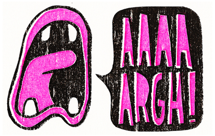
Love this guy, based in Berlin and rocking some major illustrative talent! Think this will be a great point of reference for the BOTB brief. His style is incredible and where I would like to see myself by the end of this year or at least my first year out. He is also part of the Peach Beach Collective in Berlin, where I will hopefully be going in the summer for a portfolio review and a jam. He uses a lot more crisp and considered vectors, which is something I need to get a hold of, especially the tablet I got bought but have not done anything with yet.
Due to the versatility of his style, I really think that it can be applied to scientific means, as well as having a positive effect on my own work both illustrative and informative in regards to colour palettes.

Thursday, 26 April 2012

Mister Millerchip


Once again an illustrator to add to the pile.... but seriously Millerchip's mural work is something I would greatly like to be involved with after the course, meeting new people and contacts whilst having a laugh and doing something creative to break the monotony! His work relates directly to what I have been trying to do: create an easily identifiable character style. The B&W palette he uses makes his work stronger, since all good images should be able to function without colour (in some instances). The mural I want to propose feeds directly into this as well. 

Wednesday, 11 April 2012

From Concrete to Canvas....

I re-read one of my bookshelf classics today, From Concrete to Canvas, which documents the skaters transition from doodler to artist to illustrator. I forgot how much this book influenced me in terms of illustrative style and approach to composition when drawing. There are two illustrators who I think are incredible at what they do and have stuck with me for the past 2 years.


Mr Gauky
Jeremy Fish
Michael Sieben


They influence my practice by their often twisted imagery smoothed over by a well presented illustration, that has potential to sell for fine art prices as their individual practices have moved on, especially in Jeremy Fish's case. Gauky has an aesthetic I would love to match but that would take much time on my own part, but Sieben is my main man so to speak. His work and style is distinct enough to have an application across magazine/editorial with the ability to transfer to merchandise. The reason why I chose the skateboards and merch in his work is because I will be pursuing a brief after the course which involves a local skate park, their branding and merchandise/painting opportunities.  This will be better explained in my DC presentation.

Wednesday, 21 March 2012

Format and Finishes


Just thought I would catch up with some much needed print knowledge, especially since my SOI declared that I knew alot about the subject and intended to produce work integrated with some interesting finishes.
The book was a great source for some of my briefs and sped up development of the CODE brief significantly. The rest of my annotation can be seen in the PDF.

Tuesday, 13 March 2012

Poster Roast


Amy directed me to this incredicool website that helps to promote poster artists by holding events in the same vein as flatstock, where you can sell your prints on a stand or on their online store. The amount of exposure is awesome, with people like last years graduate Kate Prior being showcased amongst greats like Drew Millward and Luke Drozd. I think if I get into the music scene it would be a fantastic platform to get myself out there, but the level of professionalism is beyond me currently, until I get some positive footing in a style that is consistent and recognised.


They even have their fingers in gallery pies, with cafes and restaurants being used as permanent mini-galleries like The Black Heart in Camden.


Saturday, 3 March 2012

Jambonbon


I really love James' website design, which I will be using as a template for my own. His illustration style is akin to my own, although a bit more innocent and motion directed. His mates Daddison, who I mentioned on my FMP blog a really cool illustrative type guy who I will be emailing about going to visit Bristol for a chat and what not. Jambonbon also led me to a cool site called we dream of meat, a plushie company that is getting known up and down the country, and overseas. Possible business venture if I manage to convince someone to manufacture for me...

Peskimo

Peskimo are a collective based in Leeds, well they are in fact a couple who have been working freelance since 2004. They have worked with the likes of Kidrobot, Barclays and Natwest, to name but a few. They specialise in editorial and publications, with a focus on print finishes and tend to produce quite a few screenprints to sell as artitsts. I love their aesthetic and the fact they are entirely freelance.
Their work is renown for striking bold colours and minimalist illustrative technique, reminiscent of 1950s hannah barbara cartoons.


Friday, 2 March 2012

Derek Eads


Just really like the variety of characters you can get from a simple framework, despite the cutesy appearance I think his work holds considerable water. It is similar to how I used to illustrate, so I am not sure if its a nostalgia trip or if I will use this as relevant context to my work.


Lauren Gregg


Her use of colour and the way she produces her prints via traditional methods draws me instantly to her work. Again another freelancer who exists soley to produce and create. She has done alot of design related work in her early career then started doing editorial illustrations and it all kicked off from there. Sort of mirrors my intentions, I would like to keep design as a side skill but primarily produce works purely image based as I thouroughly enjoy the practice and the community that is the end result of socialising.


Doug Larocca


Doug is part of a collective that exhibit regularly and mainly produces for afore mentioned exhibitions for collectors and fellow freelance illustrators/artists. His style appears childish, but I think that his linework and bold colours make up for this. A good source of character inspiration as the often abstract, contorted shapes really aid the way he works and the approach I will take for the brief.