I think that alot of their work is of such an industry standard it dwarfs my own work, but inspires me to be on a level with their portfolio of work. They use alot of photography/artwork that is supplied by the clients, but some they source themselves, or render in photoshop. I particularly like their work on game promotion and branding across a range of print based ephemera to enhance the marketing side of gaming, something that I am interested in.
Since the game industry offers the most jobs at the moment, I figured that I would indeed like a piece of this pie. CASE STUDY.
Infamous 2 promotional materials sparks the consumer within me to instantly want the products in my hands. To inspect, double check their authenticity with the game - as I am banal in detail in research - but it evokes such pleasure in myself as I know what it is like waiting for a long anticipated, highly commercialised, rich in depth game world that offers a limited edition packaging.
Project
inFAMOUS 2
Client
Sony Entertainment Europe
Year - 2011
Deliverables
Media Kit
Website
Specifications
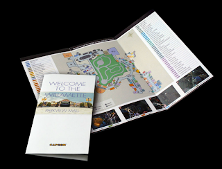
Limited edition of 2000: Custom inFAMOUS 2 embossed leather wallet, Lost Property letter, brown manilla post marked envelope, localised newspaper clippings on newsprint, A2 Chromalux art poster, concertina foldout map, 6 polaroids, Cole's bike courier ID and bank cards, local flyer card, scrumpled fake money, restaurant receipt, CD-R styled game asset disc, review code disc and moral reward website.
Overview
They have produced a presskit for SCEE's inFAMOUS 1 the year before, putting them on top of the list for producing similar work as well as actually winning the pitch for the game.
The brief asked for a high quality, limited edition media kit that would depict inFAMOUS 2's key features, new setting and it's creative proposition; "the power is yours, how you use it is up to you" to engage the recipient, having them make a choice at some point which evaluates whether they are good or bad.
Their concept played on the main character's use of parkour and that his subsequent pocket content had been handed into the council Lost Property Office whilst exploring the city of
New Marais.
The media kit arrived in the envelope along with a letter from the New Marais Lost Property office asking if the enclosed items belonged to the recipient.
The assets were directly sourced from the game, with key marketing information integrated into the newspaper clippings, concertina map and the polaroids featuring in game screenshots.
The moral choice is do you keep something that is yours or do you return the items to the Lost Property Office website and try to return it. Those who did however were rewarded with an exclusive DLC (DownLoadable Content)
Result
"The presskit got great feedback, with SCEE commenting it was "one of the BEST kits we've ever made!! So so pleased with it", and was featured on a number of prominent videogaming websites, alongside a plethora of 'unboxing' videos on YouTube."
There are so many amazing examples of press kits on their site I might as well turn this into a case study!
Project
God of War III Media Kit
Client
Sony Computer Entertainment
Year - 2010
Specification
Limited edition of 2800:
- Custom made distressed wooden box with inlay and screenprinted lid
- Concertina booklet with wax seal
- A4 Chromalux scroll poster with hessian tie
- 6 x art cards with gold foil block
- Engraved metallic coins
- 2 press discs.
Overview
Commissioned to produce a press kit to support a pan-European PR campaign for God of War III.
Despite the game's 18+ rated content, the kit couldn't be too extreme in order to publicise the game to a wider audience.
Collaboration with manufacturing specialists to a tight timeframe, they created a battle-scarred wooden box full of God of War themed content that looked like it could have been found on the brutal battlefields of Greek mythology where the game is set.
"The highly tactile materials and attention to detail showcased the game's artwork creating a dynamic, visually impactful press kit representative of the realm, furthering the marketing impact of the game and earning it rave reviews."
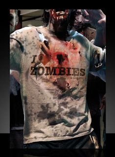
I chose this next project in particular due to its concept; zombies are associated with consumer culture and tuning out from the 'real world', so I found the irony in the campaign laughable, since both the concept and the content reflect this, especially since the merchandise is worn by the zombies in game.
Project
Dead Rising
Client
Capcom
Year - 2008
Specification
Packaging, print advertising, POS.
Overview
Design of the global campaign for the Xbox 360 version of Dead Rising, and the packart and advertising for the Wii version, Dead Rising: Chop 'Till You Drop
They have also done a series of case studies, but I will be focusing primarily on the study on Sony Computer Entertainment.
Background
Sony Computer Entertainment send out regular media kits to the mainstream media (print and online) to publicise their hardware and software. This was to be their largest presskit to date - a mediakit that spanned hardware, software, PSP and PS3 to reflect and publicise the new Playstation 'Brand Glue'; a philosophy, house style and tone of voice that would make it distinct than its rivals. (Xbox, PC, Steam, Wii and DS)
Brief
"Produce a creative, high quality, vibrant and engaging media kit that packages together all PlayStation 3, PSP and PlayStation Network related content into one pack. It will need to cover a range of different brand messages whilst targeting a range of different media - trying not to encompass everything under one creative idea, that does not alienate the campaign objectives of the separate platforms and content"
'PlayStation offers surprising and unexpected experiences. Rich experiences with open-ended potential and a tone of voice which is entertaining, playful and direct'
"The design, materials and techniques should all be high quality, and tactile (but not expensive to produce) and also reflects PlayStation's tone of voice and the brand guidelines. The media kit needs to of course catch the attentions of or engage the journalist receiving the kit and also deliver all the information on our products and content in an uncomplicated way.
"We are open to and looking for new, untraditional, creative ideas on how we can present the media kit from what has been done in the past, that will surprise and engage our media."


