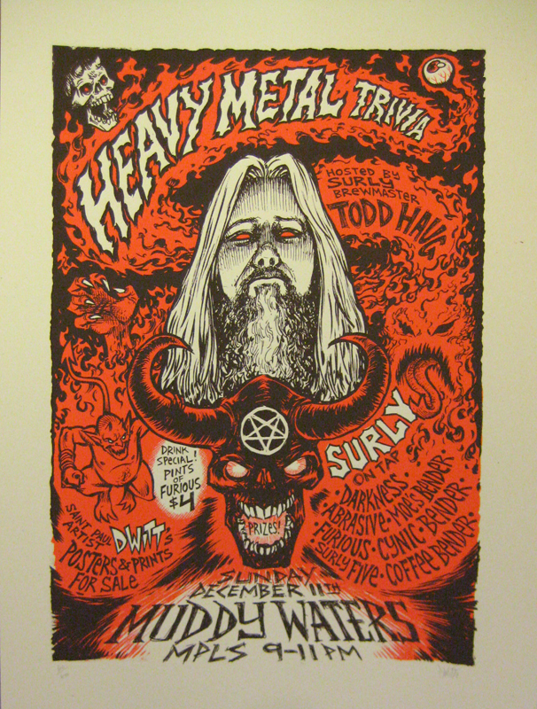
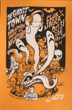
I obviously could not illustrate quite this way, nor to the level of perfection just yet as I have not had the chance to fully develop my own sort of style, but I think the use of a limited colour palette really aids in the overall effectiveness of the posters. The illustrative type is the main port of call for Dwitt, as it is something I really enjoy and would love to take further given the direction of the brief. Compositionally they are all perfect and take into consideration the scale at which they are produced, something I will have to take on board if I am to make a decent go at this.


