This was and was always going to be the toughest module of the entire course. I have however gained more than just experience and a portfolio I dont feel ashamed of, I have gained acceptance from a group of peers I thought would chew me up and spit me out like the previous year. I have made some friends, designed some good work and gained a whole heap of new lessons that will bank within my cortex for many years to come. My practice has reached a stage where I feel as if I could happily carry on and create even better and more visually stimulating work without fear of ridicule or personal defeat. I think from what I have talked about with tutors, pros, peers and mates is that I have a much clearer - yet not fully formed - idea of what my future holds. From how to present myself, how to get myself known, who not to call, who to call and how to be someone I will be proud of.
I believe to have succeeded in my illustration abilities and learnt that if I spent time on what I am doing whilst keeping in mind a strategy for producing work, I can create wonderful, high quality and near professional imagery. I have managed to achieve my goal of actually making full use of the processes and workshops available to me, rather than wasting time and deliberating over what can and cant be done. Being a doer not a dont. I took on a range of briefs to make up for lost time in previous years where I would create abhorrent, unprofessional, unconsidered work that just wasted my time on the course. I think that I set the bar a bit too high for myself in order to try give myself the best chance to seek out employment/freelance work when I graduate, but have loved the extremities of late nights and hard work despite the overall outcome.
The briefs were diverse enough for me to try and test a range of abilities I thought I did not have; type, illustration, in fact the whole bag, but I am confident that I can and have applied my own personal touch to my projects, despite my feeling of "its all a bit late for that now" syndrome. I can confirm though that after all of this work and tribulations that I am indeed an image driven illustrator/designer with a long way to go, but I have accepted this and am eager to see what I can do, where I will go and how I will shape my future.
The lack of actual hand drawn illustration was a fault of my own, lending to personal confidence issues and an overall draining of time and responding to managing multiple briefs. I think I really could have found more ways to include my style of illustration to fit into some of my other briefs, but once again down to self-doubt and relevance to each brief's context. I really believe that I have enough time and experience to develop my skills further for future endeavours. From feedback from peers and others, I feel as if I am at a stage where I could confidently approach others to collaborate or work for.
The products I have produced are a mixed bag, to be honest I think I could have produced something of a much higher quality than I have submitted, but that's down to not trying everything due to financial restraint and poor planning.
The 2920 brief could of been sent of much earlier, but I was being finnicky about the outcome and paid the price as it has not even arrived yet. I am proud of that brief as a whole, as I created a whole range of top quality prints, especially concerning the Treaty and the Morag Tong writ of sealing. They were the pride of the range of deliverables because they came out the best in terms of how I foresaw them and how they manifested physically. The map was the weakest, as I should of screenprinted it onto cloth, but decided that it would of been safer just to print it digitally and then deal with the outcome. The method of production for the map would have changed if I were to redo the brief, as the tatty ends do it NO JUSTICE. I was under the influence that I would make it look presentable, but time has not been my friend. The chest itself will be redone after I get it back so it fits in with the rest of the brief. I will also be making the brass replica dagger as it kills me how unreliable blacksmiths can be.
The quality of Jenny's deliverables were a mixed bunch, to start with the production was left until very late, as I believed I could satisfy the deadline as well as produce something that, physically looked professional. The box looks amazing, but that is because I did not make it. The prints/postcards came out unaligned, but that is because I let Jenny print them as she was disorganised and had to take my later slot which cost me valuable deliverables for the other briefs. I am not entirely pleased with the entirety of the brief's deliverables, but I am glad that she has some cool promotional materials that I can reproduce in time for her EOYS.
Code magazine came out pretty well, despite the draft issue in the cover being made by myself, which turned out terribly, yet rectified by sending it off to be produced. The quality of the VG book in tandem was not entirely up to what I expected, but the positive is that I managed to research and discover a whole range of self-publishers and their respective quality when concerned with publications. I think I really should have produced more prints for the VG feature, but once again poor planning and lack of project management did not allow for this.
If I were to redo this module, I would definitely make sure that I stuck to a brief until it came to fruition rather than allowing it to fall through my grasp and then I lose all interest in it and its subsequent impact. I would also develop more deliverables and try to exploit everything to its fullest potential rather than scaring myself into thinking I cannot produce something to a high or acceptable standard.
I would definitely get everything designed, and sent off to print much quicker as I have been waiting around for ridiculous amounts of time and generating a whole hotbed of stress for myself which doesnt really help at all.
I came out of this module feeling more confident but not entirely convinced of my level of skill in relation to graphic design. I do feel as if I could go out and effectively collaborate or apply through gritted teeth due to the existing levels of peer professionalism which tends to dampen my spirits and overall confidence. I am worried but excited about my future, I worry about my time management, I worry about alot of things, but I will give it my best, try get a job in a print studio and be the best damn illustrator I can be, hoping to join the ranks of those I worship.

Showing posts with label Brief 3: CODE MAG. Show all posts
Showing posts with label Brief 3: CODE MAG. Show all posts
Wednesday, 30 May 2012
Code Magazine
Firstly, if you didnt know, I love games; the culture, the designers, coders, everything. This brief for me was like creating the ideal publication for myself and my friends. The idea was not a selfish intention, rather I just wanted to share with everyone (target audience included) the fascinating and often heavily inspired world of gaming culture.
The sourcing of the information for the brief started off as an exciting venture, creating a database that mirrored my current cult knowledge of the subject as well as finding out things that I never thought existed. The hardest part was sieving through the relevant information into what was appropriate and what I wanted in the magazine, whilst adhering to the main concept of the brief I wrote up. The cover designs and type decisions were relatively easy to make, as I used existing publications and a few tried and tested methods to see how they functioned as a brief.
The cover designs were, looking back on it, not nearly as visually striking as I thought they would be, appearing more like a zine than an actual professional publication. The feedback was incredibly positive however, with a majority of people not getting round to my other projects due to poring over the information presented. Coming back to the imagery used for both the Virtual Geographic feature and the covers, I believe that this concept was indeed strong enough to carry the whole brief and give it a nice tie in. Looking back at it though, I could have made a much larger and extensive range for the brief, I just got to the "final stages" of the brief and finalised it as the deadline loomed nearer.
I do think that this is my favourite brief, not just because of the content, but the fact that I really got to grips with type and layout as I never had before, not being bored with the subject matter was a major aid in this. I got to explore experimental type in a formal way, as opposed to my illustrative type I use in my practice, which was a huge learning curve that helped me massively and will continue to do so, as I intend to discover the full range of possibilities of self-publishing in the future.
I do wish I had got the concept nailed for this earlier, but there is no point crying over spilt ink. I think that the online presence should have been fully exploited due to the nature of the brief, as well as providing me with the necessary practice to design and code websites which I could have done with for future endeavours.
In hindsight, I think I would have made this into a more illustrative endeavour, but I believe that sometimes I design not for myself but for others, trying to produce work "they" want to see. But from this and most of the briefs I chose, it shows that I dont just make "pretty pictures" but I can apply myself to a range of different briefs and ways of working, despite the average outcome of each project.

Thursday, 10 May 2012
Crit
All in all, a very helpful crit that allowed me to see what I could not, in terms of where to go and what to do with my briefs.
The responses to my questions were answered in a range of ways:
(NR - Nat and Rob, MR - Meryem and Robyn)
1. NR - look at advertising/context, how it would be promoted, through the website?
MR - "It's strong enough that anyone who should know, will know"
- This means that I have successfully reached a closing point for the brief in regards to overall design, but need to look into how the magazine would be promoted.
2. NR * see above
MR - perhaps some additional print material - stickers, posters etc
3. NR - Watch out for widows, has good size and style, but use discolouration for the background to keep it in with the "old world"feel
MR - Yes
4. General agreement, just develop a bit more.
5. NR - Could have posters or packaging instead
MR - Enough publications, just need something printed or boxed to tie it all together.
6. YES!
7. NR - Keep eyes same over all illustrations, type is great and variety of type works for the identity, but use specific colours.
MR - Awesome, just keep going with them
8. *see above
9. Great extension, keep going.
SUMMARY:
+ I need to have more annotation on my posts to inform and explain everything I have done up until this point
+ Despite loss of files, I need to post relevant info/development work to enhance marks and presentation
+ Why am I doing something?
+ Applying deigns to a range of products
+ Visually impressive.
Wednesday, 9 May 2012
REVIEW
Open publication - Free publishing
Bottom of the Bottle was put on a backburner for regrettable reasons, however, I have quickly found a style that has been appraised out of crit circles and a hand type solution that compliments the style I am going for. I just have alot of illustration work to do and development, although I am confident I will have alot done for this brief as I am wholly enjoying the project and wish I started it sooner.
I will be starting the preliminary mural this weekend.
Open publication - Free publishing
The most annoying part of this brief was making sure I found a border/cover decor suitable for the brief and of a quality that I would be happy with before sending off to the printers to be bound and foiled. I just cant afford to make a mistake in regards to production values, this aside, the die cannot be changed once purchased. I will be sending off the final designs tomorrow to make sure that I have enough time to produce the book itself.
I will also be re-visiting Spink and Thackwray to double check leather stocks and for a final estimate. I have emailed about 10/13 binders in total and they seem to have the quickest turnaround and best value for money.
The dagger needs to be modelled in 3DS and my blacksmith is incredibly awful at being in contact, despite my numerous attempts at contact.
The map needs to be foiled and the trouble came from screenprinting where a woman was cleaning screens for 2 days. No joke, she had the largest screens available and no one else could really clean their screens for processing. That said, the power hose nozzle broke, but has now been replaced. The map will be done by tomorrow since I will be able to treat the screen today.
Open publication - Free publishing
This is the brief I am least pleased with in terms of quality and the overall outcome, I think it is safe to say I enjoy reading about and learning about science rather than illustrating its ideas and concepts. I thought on a limited basis of how to approach it and as a result, it is obvious that it is lacking as a significant brief. I do however have plans to produce a replica Times newspaper that echoes the many articles and stories published recently on the role of science in our society, how it is often disregarded despite the irrefutable logic and reasoning behind the practice. This will then be followed by the magazine supplement demonstrating the importance and nature of science. More or less finished, I will just be focusing on the paper for the time being and have print slots all next week.
This is the brief I am least pleased with in terms of quality and the overall outcome, I think it is safe to say I enjoy reading about and learning about science rather than illustrating its ideas and concepts. I thought on a limited basis of how to approach it and as a result, it is obvious that it is lacking as a significant brief. I do however have plans to produce a replica Times newspaper that echoes the many articles and stories published recently on the role of science in our society, how it is often disregarded despite the irrefutable logic and reasoning behind the practice. This will then be followed by the magazine supplement demonstrating the importance and nature of science. More or less finished, I will just be focusing on the paper for the time being and have print slots all next week.
Open publication - Free publishing
Code is the most complete and the brief I am currently most pleased about. The content took me ages to source and refine and edit and re-edit and re-re-edit. I do however, think it would be wish and entirely beneficial to the content and concept to propose a website that demonstrates how to redeem the online voucher code for the Virtual Geographic feature. I think my only concern is taking decent photos and finishing my new copy of quest which I received yesterday in the post.
OVERALL
General delays due to unforeseen circumstances or what is known in the insurance biz as an "act of god". Which can be easily rectified by producing and finishing off all the relevant components for the briefs.
My own self-doubt and over cautiousness in regards to my design work has halted visible work for which I am fully aware of. Once again this can easily be rectified by re-timetabling my weeks and making sure I stay on track for hand in.
Tuesday, 1 May 2012
The Quest for issue one is complete.
Just sent this off to print on a new site just to test the water and see if the service is any good through issuu/peecho. Just got an email through that it may be up to 3 working days til it is dispatched and an additional 8 working days until the document arrives. BUGGER. On the plus side I will have a lovely copy to leaf through for the final show and whatnot.
ANYWAY. Here is the final final draft final of cOde: Quest. If it catches on and I can find suitable time/someone else to work on it with me I will make more and make it even more accessible. Until then it will stay in the bowels of my production den until then.
Development PDF:
ANYWAY. Here is the final final draft final of cOde: Quest. If it catches on and I can find suitable time/someone else to work on it with me I will make more and make it even more accessible. Until then it will stay in the bowels of my production den until then.
Development PDF:
Open publication - Free publishing
Thursday, 22 March 2012
CODE MAG: Cover Progress
Open publication - Free publishing
Getting much closer to finalised cover designs, really thinking they work perfectly as a set/series, will just have to test out the tracing paper idea to see how that works. I think I will probably be going with the closer kerned text, as I want people to be able to see the image behind the text without getting too distracted/obstructed by the type.
Wednesday, 21 March 2012
CODE Cover Issues
I think I'm getting much closer in terms of resolved covers for the magazine, the use of vivid colours is to draw the reader to the magazine as well as contributing to the aesthetic impact/underlying concept. Bringing the content to life with the palette and writing style goes hand in hand, I believe.
Tuesday, 20 March 2012
OUTLINING DELIVERABLES...again
Mainly doing this to clarify the abundant turd flinging session currently inhabiting my own skull.
OK, so I need to clarify how this publication would be received, how many issues would run and think of how to expand/make it a piece of abstract, yet functional design.
PRODUCT
The product is a magazine that offers and alternative to contemporary gaming journalism by using real people who are cynical, critical and judge games based on the rules of 'Yahtzee':
Context, Challenge and Gratification. None of this nonsense about graphics and blah blah blah. Judge a game by what matters and what can give an individual some unbiased info on the latest titles.
The magazine itself focuses rather hypocritically on game aesthetics in its visual content, that is to say, by sections that would appeal to the non gamer, since other magazines have done this already and has worked successfully. The beauty of games are highlighted yess, but out of a review context that often skews and subverts people to buying a game because it wooks pwetty.
IDEAS FOR IMPROVEMENT
- A pullout in the middle section that has postcard size prints from the Virtual Geographic feature which would be a unique and a running freebie that encourages the sale of the print version.*
- Make sure that each issue has a theme or a subject matter that is coherent and has articles that give the magazine some contextual grounding.
- The magazine could be a newspaper style publication that can be distributed easily. Although this could debase the visual content and give the publication a less important look/feel.
- An online presence in the form of a blog/website, where relevant articles, illustrators and general content associated with the magazine can be posted. A digital format of the magazine can be downloaded for a small fee, but the Virtual Geographic feature is unique to the print edition, helping to promote print based gaming magazines. This is opposed to finding/sourcing info on games on the almost limitless amount of sites that offers news and features.
RANGE
The range includes 12 editions of the magazine, because it would run monthly due to the nature of released games in a year, also allowing for backlog of in-jokes, articles and stories that are relevant to the target audience. So 12 covers which would all feature the game explored in the Virtual Geographic feature would be on the front cover, along with the issue's main stories covered in the header text.
The online presence/site would be part of the range, as well as the freebies available with the print edition.
DISTRIBUTION
This magazine would be picked up by members of a creative collective, a young person's institute (uni or college) gamers and those interested by the front cover and content.
So distribution ranges from purchasing it from a shop that is in proxy to said audience and the online presence that would accompany the publication.
For now, I have a rough idea, but nothing solid, so I will sort this out over the next few days.
PRODUCTION
The magazine itself is going to be either a full gloss cover/back, relatively light at 130/150gsm, with an ICO matte paper for the content or a fully light matte coated print. Full CMYK obviously.
Wednesday, 14 March 2012
Code Draft
Ok so I just got on with it an started designing to the current specifications and have managed to come up with an easily recognisable style, echoing Access and Shortlist in terms of using shapes and bold colours. Think it flows relatively well, although I will need to sort of the colour scheme and probably come up with some form of overall theme for each issue as at the moment it looks like a disorganised mess. If there was a theme I think it would tie it all together and allow for ease of information input.
Friday, 9 March 2012
Logo work
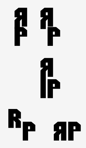


The renaming of the magazine came about from a mini crit I had with Rob, Ando and Paul. They said that Ruddy Pixel didnt quite sound like what I was aiming to achieve with the magazine. I agree in some respects as it is a recycled idea and I should be drafting more interesting and original concepts. So I drafted out a few ideas and messed around with some type to see what would look the most appropriate. I do think that the similarity of the last logo is too much like the gamesmaster and generic commercial gaming publications, but its what I am running with to see if it functions and get some helpful feedback.
Monday, 5 March 2012
Ruddy Pixel Content
OK, so from the scans/initial ideas for content of the magazine itself, I figured that I could lump a load of certain subjects together to constitute a full page.
I will include:
I will include:
- Contents page/splash page - This would include the "page 3" element mentioned in the scan.
- Design/illustration - This would include looking at boxart for games and looking at associated works that other designers/illustrators have interpreted. This is a running theme. Each person mentioned will have a reference section at the end including contact details etc.
- Lifestyle - This section will cover random gamers' lives, what they do on a daily basis and their general interests. This will have 2 every week, one professional designer/illustrator and a member of the public. They will answer some standard questions that will be applied every week for each interview. It will also include photos of their gamespace and collection of games.
- Charts - This is a predominant factor amongst gamer mags, except that Ruddy Pixel offers current sales charts of games with a counterpart chart that is picked by featured illustrator/designer or one of the staff.
- Reviews - Standard. But with a difference, instead of gratuitous praise for games, reviewers will give both pros and cons. The idea behind our reviews is that we not only come to a conclusion, but we have a voice. A loud attitude that is in the vein of Ben Croshaw Yahtzee, breaking, shaking and sifting through the developers' grease to find the real game behind the graphics.
- Batteries Not Included - This will tie in with the lifestyle section, looking in particular at LARPers and how they play their games, what happens when people break character and visa versa.
- Fanbase - This will be the readers' page, A chance to answer and ask questions, both staff and readers are invited to provoke reactions and essentially let the readers have it off on a section.
- Random Loot - This page is dedicated to the sheer scale and variety gamers go through to visualise their favourite games - in the guise of oddities and ridiculous photos. Includes a section on where to buy stuff related to the articles.
- Pulling Chips/Pulling Pixels - This DBS focuses on a particular game and breaks it apart for critical analysis. Looking at historical references, gamer theory and issues concerning identity.
SO. To clarify the sections and their individual content...
- CONTENTS/Page 1-3: Front cover, contents page and the page 3 feature. It will be a character's silhouette that you have to guess, or a pretty girl in cosplay (PROBABLY NOT) or a particular piece of design/illustration that is particuarly sexy and relevant to the context.
- Random Loot: This section will start with designers/illustrators that have game-related work, looking in particular at their gaming lives and favourite games. The section will then lead into the oddities and products that can be bought or have been made by mad gamers. This is to give those not aligned with video games a taster of what the mag is about and allows high impact visuals and content that suits them and not just the gamer.
- Batteries Not Included - This section is where I will be looking in depth at the lifestyle and attitudes associated with gamers. LARPing phenomena, normal gamers and designers take the stand in this section.
- Soft Wars - This section is all about reviews across all platforms.
- Pulling Pixels: This is the gamer theory/mass discussion section that focuses on a particular game to break apart.
- Counter Charts - This is the charts section.
- Features: This section covers the info regarding contributors and guest features in the mag.
FORMAT: Need to decide quickly so I can start estimating word counts/fonts etc. SO I am going with either the Insight format or gamemaster's format.
Subscribe to:
Posts (Atom)