Open publication - Free publishing

Showing posts with label Project File. Show all posts
Showing posts with label Project File. Show all posts
Thursday, 31 May 2012
Wednesday, 30 May 2012
End of Module Evaluation.
This was and was always going to be the toughest module of the entire course. I have however gained more than just experience and a portfolio I dont feel ashamed of, I have gained acceptance from a group of peers I thought would chew me up and spit me out like the previous year. I have made some friends, designed some good work and gained a whole heap of new lessons that will bank within my cortex for many years to come. My practice has reached a stage where I feel as if I could happily carry on and create even better and more visually stimulating work without fear of ridicule or personal defeat. I think from what I have talked about with tutors, pros, peers and mates is that I have a much clearer - yet not fully formed - idea of what my future holds. From how to present myself, how to get myself known, who not to call, who to call and how to be someone I will be proud of.
I believe to have succeeded in my illustration abilities and learnt that if I spent time on what I am doing whilst keeping in mind a strategy for producing work, I can create wonderful, high quality and near professional imagery. I have managed to achieve my goal of actually making full use of the processes and workshops available to me, rather than wasting time and deliberating over what can and cant be done. Being a doer not a dont. I took on a range of briefs to make up for lost time in previous years where I would create abhorrent, unprofessional, unconsidered work that just wasted my time on the course. I think that I set the bar a bit too high for myself in order to try give myself the best chance to seek out employment/freelance work when I graduate, but have loved the extremities of late nights and hard work despite the overall outcome.
The briefs were diverse enough for me to try and test a range of abilities I thought I did not have; type, illustration, in fact the whole bag, but I am confident that I can and have applied my own personal touch to my projects, despite my feeling of "its all a bit late for that now" syndrome. I can confirm though that after all of this work and tribulations that I am indeed an image driven illustrator/designer with a long way to go, but I have accepted this and am eager to see what I can do, where I will go and how I will shape my future.
The lack of actual hand drawn illustration was a fault of my own, lending to personal confidence issues and an overall draining of time and responding to managing multiple briefs. I think I really could have found more ways to include my style of illustration to fit into some of my other briefs, but once again down to self-doubt and relevance to each brief's context. I really believe that I have enough time and experience to develop my skills further for future endeavours. From feedback from peers and others, I feel as if I am at a stage where I could confidently approach others to collaborate or work for.
The products I have produced are a mixed bag, to be honest I think I could have produced something of a much higher quality than I have submitted, but that's down to not trying everything due to financial restraint and poor planning.
The 2920 brief could of been sent of much earlier, but I was being finnicky about the outcome and paid the price as it has not even arrived yet. I am proud of that brief as a whole, as I created a whole range of top quality prints, especially concerning the Treaty and the Morag Tong writ of sealing. They were the pride of the range of deliverables because they came out the best in terms of how I foresaw them and how they manifested physically. The map was the weakest, as I should of screenprinted it onto cloth, but decided that it would of been safer just to print it digitally and then deal with the outcome. The method of production for the map would have changed if I were to redo the brief, as the tatty ends do it NO JUSTICE. I was under the influence that I would make it look presentable, but time has not been my friend. The chest itself will be redone after I get it back so it fits in with the rest of the brief. I will also be making the brass replica dagger as it kills me how unreliable blacksmiths can be.
The quality of Jenny's deliverables were a mixed bunch, to start with the production was left until very late, as I believed I could satisfy the deadline as well as produce something that, physically looked professional. The box looks amazing, but that is because I did not make it. The prints/postcards came out unaligned, but that is because I let Jenny print them as she was disorganised and had to take my later slot which cost me valuable deliverables for the other briefs. I am not entirely pleased with the entirety of the brief's deliverables, but I am glad that she has some cool promotional materials that I can reproduce in time for her EOYS.
Code magazine came out pretty well, despite the draft issue in the cover being made by myself, which turned out terribly, yet rectified by sending it off to be produced. The quality of the VG book in tandem was not entirely up to what I expected, but the positive is that I managed to research and discover a whole range of self-publishers and their respective quality when concerned with publications. I think I really should have produced more prints for the VG feature, but once again poor planning and lack of project management did not allow for this.
If I were to redo this module, I would definitely make sure that I stuck to a brief until it came to fruition rather than allowing it to fall through my grasp and then I lose all interest in it and its subsequent impact. I would also develop more deliverables and try to exploit everything to its fullest potential rather than scaring myself into thinking I cannot produce something to a high or acceptable standard.
I would definitely get everything designed, and sent off to print much quicker as I have been waiting around for ridiculous amounts of time and generating a whole hotbed of stress for myself which doesnt really help at all.
I came out of this module feeling more confident but not entirely convinced of my level of skill in relation to graphic design. I do feel as if I could go out and effectively collaborate or apply through gritted teeth due to the existing levels of peer professionalism which tends to dampen my spirits and overall confidence. I am worried but excited about my future, I worry about my time management, I worry about alot of things, but I will give it my best, try get a job in a print studio and be the best damn illustrator I can be, hoping to join the ranks of those I worship.
Bottom of the Bottle Evaluation
For an illustration brief that I was meant to really develop my style and create a range of awesome prints via my favoured method - screenprinting - I didnt really set out to achieve what I envisioned. In retrospect, the brief was a dry one compared to some of the more professional concepts that circulated around the studio, but I just wanted one brief where I could flex and test my illustrative muscle.
The initial branding of the night was meant to be a fixated logo, but I was glad that I decided to create a range of illustrative type as it is something I enjoy and wanted to push further both professionally and personally. It also allowed me to set a sort of feel for the rest of the project which made it alot easier to progress with. I think my major issue was at the start of this brief, I had just got my tablet and relied on my limited knowledge to try produce illustrations on a purely digital basis, which hindered the project's progress and created generic looking "grunge" illustrations that did not come out how I wanted.
Early on in the development process, before I rationalised that I did not really need to come back to the brief until later on, I thought that I had a good enough style to run with. Although self doubt was constantly creeping about up until the second to last crit, where incredibly positive feedback came back from peers I highly value and respect for the quality of their own work.
The next stage where I chose the colour combinations was a rush job, as I left it late in development and settled with a combination that I thought worked very well, but upon reflection I could have created a palette that reflected each night individually, with one colour tying the range together. Another major issue was the lack of range in terms of illustrations and the underdeveloped imagery. I wish I could have just taken the brief under my wing and made it the capitalisation of my illustrative style allowing for peace of mind and a good place to develop further upon submission. I did however, get to a stage where I am confident enough to show people my illustrations without fear of rejection.
The project as a whole feels half finished, as I didnt get everything done so I could print some physical deliverables, I do have the promo pack mailout but I just didnt see the point in submitting something that appeared unprofessional and without the accompanying deliverables to back up the entire project.
The brief could have done with alot more in terms of actual products, but again I left it too late and depended on just winging it. I did enjoy doing it, especially adding the detail and tones that I think really bring the project together and demonstrate my evolution as a professional illustrator, although this title is a premature label until I get myself known more.
A huge positive from hindsight is knowing where to improve and as such, I cannot wait to get involved with other illustrators and get some public experience collaborating.
Jenny Sneap Evaluation
Firstly I have never even worked with a client before, or done any branding for a real person, normally a fictional company or some form of non-specific design. This was a nice change, I didnt fully enjoy the mundanity of creating a range of branded pieces as it tends to be repetitive in a cut and paste way. But it did give me valuable experience and gained a new accomplice, who will be retaking photos of my work for my EOYS portfolio. Win.
The stress of the brief coupled with my lack of knowledge in the field made this a project I thought I would struggle with, until the logo itself came to fruition and the project got under way. Normally these sort of branding briefs are the staple diet/practice of most designers, whilst I did not fully enjoy it as it was outside my comfort zone, I felt as though I gained alot of experience in working with a stressful client who didnt really know what they wanted.
The end result of the deliverables were not to a standard I would have liked, but that is down to the fact I spent the least time on this brief in regards to the other briefs I worked on during FMP. I did enjoy the processes used to give the brief a professional look and managed to make the project appear as a 'whole'.
The solander box was outsourced due to my afore mentioned lack of craft skills, but also because I wanted Jenny to have the highest quality lookbook possible and also so I had something that looked pro for my portfolio. The concept for the lookbook was the strongest and I was pleased that I could produce something that was out of the conventional designs other members of the course were working with.
The spot varnish/foil effect for the entirety was the driving force behind the brief, which I think really helped support my SOI and my general intentions of trying an testing a range of print processes I had never really had the time or money to make. The business cards were once again outsourced due to me wanting Jenny to have the best looking products possible without the expense of time or money in regards to production and managing multiple briefs.
Overall I believe that despite my personal preference and time spent in total on the brief, I think this was one of my strongest projects and one that could have been turned around a lot quicker in hindsight.
The project cost a lot more than anticipated, but it gave me a real idea of how to work to a budget despite there not being one in place, it certainly gave me professional insight into external/outsourcing work if and when needed on a job. I also gained a valuable ally who appreciated my work despite the outcome and will be able to work together on most creative endeavours in the future.
Code Magazine
Firstly, if you didnt know, I love games; the culture, the designers, coders, everything. This brief for me was like creating the ideal publication for myself and my friends. The idea was not a selfish intention, rather I just wanted to share with everyone (target audience included) the fascinating and often heavily inspired world of gaming culture.
The sourcing of the information for the brief started off as an exciting venture, creating a database that mirrored my current cult knowledge of the subject as well as finding out things that I never thought existed. The hardest part was sieving through the relevant information into what was appropriate and what I wanted in the magazine, whilst adhering to the main concept of the brief I wrote up. The cover designs and type decisions were relatively easy to make, as I used existing publications and a few tried and tested methods to see how they functioned as a brief.
The cover designs were, looking back on it, not nearly as visually striking as I thought they would be, appearing more like a zine than an actual professional publication. The feedback was incredibly positive however, with a majority of people not getting round to my other projects due to poring over the information presented. Coming back to the imagery used for both the Virtual Geographic feature and the covers, I believe that this concept was indeed strong enough to carry the whole brief and give it a nice tie in. Looking back at it though, I could have made a much larger and extensive range for the brief, I just got to the "final stages" of the brief and finalised it as the deadline loomed nearer.
I do think that this is my favourite brief, not just because of the content, but the fact that I really got to grips with type and layout as I never had before, not being bored with the subject matter was a major aid in this. I got to explore experimental type in a formal way, as opposed to my illustrative type I use in my practice, which was a huge learning curve that helped me massively and will continue to do so, as I intend to discover the full range of possibilities of self-publishing in the future.
I do wish I had got the concept nailed for this earlier, but there is no point crying over spilt ink. I think that the online presence should have been fully exploited due to the nature of the brief, as well as providing me with the necessary practice to design and code websites which I could have done with for future endeavours.
In hindsight, I think I would have made this into a more illustrative endeavour, but I believe that sometimes I design not for myself but for others, trying to produce work "they" want to see. But from this and most of the briefs I chose, it shows that I dont just make "pretty pictures" but I can apply myself to a range of different briefs and ways of working, despite the average outcome of each project.
Eureka Evaluation
Out of all the briefs, bar BOTB, I believe this is the least strong. The subject matter itself was very interesting to me, but as the brief went on and I lost all interest in infographics, I started panicking and not caring which is not a good combination especially on a final major project which is meant to be a carefully planned and thought through affair. Although with the unfortunate but not unwelcome recent realisation of what it is and what I want to do with my ambitions, I am glad I did this brief.
It was intended to be an illustration brief coupled with type, layout and editorial infographics. Already it is evident that I set myself a monumentous task, as usual I took a cliffside road rather than the comfortable bike trail by the river in terms of how I approached this brief.
I spent far too much time researching, cross referencing due to my fact-finding/anal tendencies which cost me dearly in the end. I also could not decide early enough on what subjects would best suit the audience costing me valuable scoops of time and designing sporadic and for the sake of it. I think that a major issue in all my work in college is that I seek the acceptance of my peers and those above my station when it comes to creating things, so I get bogged down in detail and trying to produce anything that I think would please the afore mentioned audience. With this in mind, I once again faffed around trying to find or discover a style that would give my work the edge I wanted. Alas it was to no avail, I fell back on vector illustrations and a colour palette I took from my favourite Youtube channel (Crash Course World History). I am not displeased with the cover illustrations, as I received very positive feedback, but on a personal note, it always feels like a bit of a cop out when I know I am capable of producing something very akin to my internal visual blueprint.
The spreads of information were the hardest part for me, as I am not good at all with layout or the formalities of type. I did alot of research, but felt like I wasnt really getting anywhere, until I just suddenly clicked. I cant remember what happened, it sounds unprofessional but I just woke up early literally just did some bits of layout and put some shapes together that I thought looked great and suited the brief. Although this again, was a latecomer to the finishing line, that I felt I should have developed more, not just for myself but for my portfolio's sake. Although I think that I am capable of creating spreads and layout out information correctly and presenting it in a unique way, I dont think I would excel in the field specifically.
Indeed a learning curve all round for this brief, but I did learn that I like reading about science, but I think there are better and more intuitive ways to do this than designing for a newspaper whose media is often skewed and biased at best. There are far better mediums out there doing a better job than the Times. I do think that the strongest element of this brief was the colour and the cover illustrations. Once again proving that I may just be a Jack of All Trades, as opposed to a Master of One.
2920 Evaluation
What started out as a straightforward brief with a subject I hold dear to my heart snowballed into a much larger problem, with regards to cost and production values. Initially it was going to be a brief that demonstrated to myself and others that I am capable of producing a professional looking project that I could be proud of. I wanted it to be the crown jewel of my third year, showing to others that gaming culture and being a nerd is cool and can produce really interesting work. I wanted to stick to the sort of feel the Elder Scrolls' universe has which is a sort of late 13th/16th century decor to it, but being able to push it in the direction I wanted it to be and how I wanted it to look.
It began as a publication brief, creating two perfect bound books that would work as a set, with a rough idea for accompanying deliverables to compliment the content within. This would have been a perfect time to develop and lay the foundations of some incredibly practical bookbinding skills, which I did not even engage with. I did do some mocks, but I realised pretty early on that I am not that talented when it comes to crafting or creating perfect publications. It was around then I decided to outsource the book, partly due to my skills, but mainly due to the high content nature of the brief coupled with the fact I had not produced a single piece of work I deemed worthy to show anyone, be it professional or peer. The research turned out to be very useful, I got to visit two establishments to talk to the binders and even got my girlfriend interested in the profession. So not all lose-lose really.
The content of the main publication for the brief was compiled from 12 separate volumes, and I spent far far too much time deliberating over what type I should use, being terribly unfamiliar with both the inner workings of indesign and the formalities of type/layout. The accompanying publication (Pocket Guide to the Empire) that I started yet never printed partially because of lack of funds, but also due to the project as a whole and the changing of the concept if I decided to keep it in. I laboured over the minor details of both the type and layout throughout even until the latest possible time I could submit the final artworks for the brief.
The ornate stamp detail on the front was subject to much internal debate over the style it was created; do I use my own interpretation of the visual approach the game favours, or do I go with an illustration I have developed and feel comfortable with? This sense of delusion coupled with the angst and confusion of trying to see my project from a potential customer's/audience's view tended to cause a large amount of dissonance with myself and the alter ego checking for "fanboy" mistakes. In the end though, I just went with the design and felt it worked fantastically. The feedback from my mocks were positive despite most people not understanding the context/content of the brief, though this didnt dissuade me from the outcome at all.
I feel that the only major positive from this brief were the additional deliverables that were inspired from the narrative in the book, mainly the Treaty and the Morag Tong deathnote. I very much enjoyed going into the printroom and building up relationships with the staff, gaining more confidence with my skills both practical and professional. After I had created the map on the digital printers and tried doing foiling correctly I got a real sense of achievement not felt when in digital print, which inspired me to research the possibilities of getting a job in the profession.
This aside, I felt as if overall I gained the most practical skills and development from this brief, I love screenprinting, figuring out registration for each print, mixing the ink and producing a whole range of products. The deliverables for the brief had a focus on traditional fonts, layout, type and logo design. The logo design element was a minor focus, yet put the proverbial icing on the cake for the range of printed products. The use of simplistic vectors when applied to a time period was a shaky move, but like I said, I wanted the old to clash with the new and I believe I have created a project that not only suits the audience, but has an element of me in it somewhere.
Submission Boards
Open publication - Free publishing
Open publication - Free publishing
Open publication - Free publishing
Open publication - Free publishing
Open publication - Free publishing
Thursday, 24 May 2012
Rough Boards
Open publication - Free publishing
Open publication - Free publishing
Open publication - Free publishing
Open publication - Free publishing
Open publication - Free publishing
Final Crit

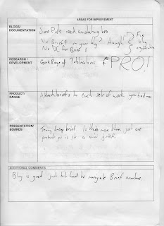

Overall a very positive reel of feedback from the post it notes and on my feedback sheets.
Generally speaking it is my blog navigation/posts that need to be sorted out, but that can be amended over the weekend as I can stay up all night/day to get it sorted. Typos, some mistakes on prints and context shots were the main source of criticism, which was gladly received, partly due to the fact I wanted the majority of feedback on the flow of my boards.
Another point raised was the stock choice for the Eureka brief being unsuitable, but this was due to there being no newsprint left in college to print on.
So yeah, crack on and sort it young Cummings!
Tuesday, 15 May 2012
Tuesday, 1 May 2012
Wednesday, 25 April 2012
PRESENTATION
Just thought I would post both of them together to see differences in information, content and flow. Generally an improvement, although feedback was mixed in terms of how professional the overall presentation went and in regards to my leaving strategy.
Lorenzo commented that it was lacking in terms of how a professional would present themselves, something I generally have not improved on in terms of quick turnaround presentations in front of the other course members. I will however, rectify this if the context were one of professional endeavour, despite this comment alone denoting an air of flippancy on my part, which is not the case, just poor time management rearing its ugly head twixt the eyes of foresight.
On a more positive note, my strategy was received well and people were generally interested to see what my ambitions above and beyond the course are. It also allowed me to have more of an insight into people I will be keeping on my contact roll after completing the course, despite the increasing plausibility of not being able to hand in a decent quality/quantity of work.
Thursday, 15 March 2012
CRIT FEEDBACK
All in all relatively positive, with an overall feel of getting more done.
E4 Animations
- Possible website to find all animations for reference
- Clapper theme would apply to all proposed films and can be used for branding for the series
Heroes of Science
- Alter the layouts a bit so that the line breaks are coherent with the indentations
- Colours work well and translate accordingly
- Keep the symbols/title the same as they work fine
Code Magazine
- Content interesting and relevant to both gamer and non-gamer
- Swords and Sorcery EP iPad game could be subject for visuals
- Artistic take on games works well
- Sold in Magma stores?
- Also make sure I link in relevant articles about game themes covered in the mag.
Thursday, 1 March 2012
Crit With Lorenzo
The Design Context publication needs to be written out in a proper brief format so I can work towards clear objectives of how and what defines my practice. The name is clear and obvious, but the publication itself needs some direction to its outcome and content. The publication itself has to be either a brief or a seperate entity. I would rather it not be assessed as a brief, so I will re-jig it where appropriate.
The Design Context book's categories need to be defined by the briefs and how they tie in with the chapters. The objectives need to be reviewed and addressed accordingly to make sure I stay on track with what I proposed.
Eureka! brief needs to be cut down considerably due to the nature of content driving the brief. Instead of doing 10 covers with the DPS in tow, it was discussed that it would be far more productive and worthwhile to do 5 cover illustrations well, inclusive of the double page spreads being designed.
This would ensure the final outcome would be professional and professional looking.
Keeping in context of categorisation and whatnot, I should make the stories fit with a theme for the overall publication. Eg military technology or life sciences, etc.
The Ruddy Pixel brief has now replaced the Tomb Raider brief because I thought that the press kit/limited edition release would not fit with my SOI and thus hinder my progress. Lorenzo thought the idea was nocel, including the various elements that compose the newspaper/mag which makes it stand out from other conventional video game journalism.
What/who/behaviour - defining the gamer and how the gamer is viewed in contemporary society. A good idea that Rob gave me was to have a page 3 'girl' in the form of a character, game or gamer/designer featured.
The E4 brief was fine, just need to start it properly, which I will be doing when I get in later....
BotB is good, just need to review what the client wants and define my deliverables.
SO, Eureka! editorial can be skimmed down to 5 stories, focus on content of the theme/category in context. 2/3 spreads a story. Probably start with 2.
Wednesday, 29 February 2012
Monday, 27 February 2012
SOI Adjustment
"An investigation into publication and print with a focus on content, delivery and illustration/image making"
Is the original statement, but due to the digital nature of some of my briefs, it can be rectified to this:
"An investigation into publication and print with a focus on content and illustration, with the potential to transfer onto digital mediums."
This is due to the fact I do talk about how certain briefs require websites as well as translating assets into animations. It is not a main focus, as I do like to work with other people for the digital side of things, but I do not want tit to be the predominant factor when considering the outcome of certain briefs.
Friday, 24 February 2012
Crit Feedback
OK so basically it was acknowledged that the collective needed to rationalise the deliverables and their significance to the rest of the SOI and the briefs included in the umbrella statement.
The Heroes of Science brief needs more of a range, with the possibility of accompanying posters or promoted so it adheres more to my SOI.
Bottom of the Bottle needs to be rationalised as to certain outcomes at my discretion. This is to avoid doing too much work for the sake of doing work. Also to make sure I create some "sexy" design as to give my work more impact.
"The illustrations are looking great, but what else could be applied to make it better?" - I think the content of the drawings need to be reconsidered as I was only thinking of the small scale impact over the actual A1 solution that is needed. I will need to draw bigger and much more detailed. More time needs to be spent on my illustrations to ensure the application is relevant to the brief.
"You could do a launch night, tickets, promotion etc..." this was a brilliant idea, despite the client not wanting to spend too much, I think this would be a highly beneficial exercise to give me more range and create a solution that is weighty and demonstrate my ability to think on a larger scale.
Tomb Raider needs to be clarified, less objects and more design. Focus on elements that will support my SOI and my intentions. A special edition publication would be much more appropriate so I will focus on trying to create more specialised print based solutions for this brief.
Wednesday, 8 February 2012
Design Context Feedback

Not only does it summarise everything I am about in terms of interests, but also my practice. It is the umbrella statement that will branch out in to all my separate sections.
The sections currently are; Science, Games, Nerds and a Who's Who section at the back detailing the various illustrators, designers and people mentioned in the publication.
Science:
- Illustrating an Idea: Visual Language: this section aims to explore the use of symbols and icons to get a point or message across through simplistic means. Also how this informs my practice as it can provide useful for information classification and helping the idea generation process.
- Editorial: Information is Key: this section aims to highlight the importance in presenting information in regards to editorial design and any sort of publication. This will chapter will write itself as I uncover various designers and illustrators who use infographics, symbols and icons in relation to body copy and the relationship between the two.
Games:
- Promotion: Interactivity and Reception: this section aims to discover the relationship between consumer and the product. Promotional material for gamers are usually highly sought after, so I think what will be interesting would be how low-budget promotional vessels are received in relation to their high budget counterparts. I will be working to a low budget on a regular basis as I lack the funds to produce something of a higher standard. Through my research and finding suitable contacts that can help me concerning the methods of production would greatly improve my knowledge of the industry ads well as networking with like minded individuals. The concept behind the product is the driving force as it usually has to tie in with in game elements that have significance in its delivery, so this will be explored in depth also.
- Alternate Aesthetics: The Gaming Cult: this section will be looking specifically at the humour and widespread demographics of gamers in relation to design and illustration. This will look at how the gaming community is part of culture as much as music, film and books. This part is largely focused on the presentation of work in relation to gaming and how video games have artistic license.
Niche Markets:
- Sci-fi, Fantasy, Film and Music: This section generally explores other ares of my interest that inspire me visually when considering more commercial work. This will be informed by interviews, emails and information regarding various artists,illustrators, designers and agencys that apply to these sections of nerdology. It will look at the relationship between type and image, to the extent of how different hierachy affects an image overall as well as the choice of colour. Processes will be referenced here, mainly but not exclusively screenprinting and more low-budget high impact decisions that inform the design process, as well as making effective solutions to problems concerning this.
Publications:
- This section has been changed from Zines, since they dont really fit in with my overarching sentiment, so I will dedicate this entire section to print processes with specs, guides and general terminology I could have done with at the start of the year. The publication section will help to illustrate all the relevant research material for this section.
To Think About:
- The proposed visits need to be rationalised, WHY?
- Print-Production-Distribution - How do these factors affect design decisions in relation to sections?
- What questions am I asking?
- How does it all inform my practical work?
Tuesday, 24 January 2012
Context Book First Draft
Ok, so I figured that currently the rough layout/content of my context publication will primarily focus on:
Promotion:
- Press kits*
- Interactive reception*
- Commercial sector of gaming industry
- Mailouts*
Illustration
- Editorial
- Gig posters
- Contexts determined by more research
Infographics/Data visualisation:
- Gaming statistics
- Science facts/statistics
* Top stories of breakthrough
* Current science trends
- Vector based visualisation
Publication for:
- Commercial print
* Stock
* print finishes
- Design based illustrators
- Zines
...and I will elaborate as I get on with research.
Current brief status:
1. Content driven, image based investigation into editorial design for the Times' supplement on science: Eureka. Content to be derived from esteemed newspapers and publishers: New Scientist, Guardian and Wired. Top 10 scientific breakthroughs of 2011.
The infographic I will be producing for this project will be able to function as a whole as well as be segmented to be applied to a range of double pages spreads relative to the cover story.
Deliverables
- Infographic representative of data collected
- 20 x Double page spreads with body copy and infographic relative to story
- 10 x Cover illustrations
2. Print driven press kit for promotion of a limited edition version of a video game, with a focus on concept and distribution. Content to be sourced from game journals, magazines and hopefully emails with developers. Image to be self-derived with minimum sourcing from previous screenshots; make the game my own.
Deliverables
- Box artwork
- Map
- Packaging
-
Subscribe to:
Posts (Atom)